History of Jurassic Park Logo: Things You Don’t Know Yet

Think about the Jurassic Park logo. What can you see in this logo? This red and yellow patterned logo is stuck in our mind for many reasons, especially for the long-going movie history.
The journey was started from the novel by Michael Crichton. Thanks to Steven Spielberg. He made a movie based on the novel that was released in 1993.
From that time, most of us become familiar with this logo. Now, this logo defines the movie franchise. It made everything more special even for the striking poster. In every poster, we saw the iconic logo. We wish to share more details with you.

What Is the Jurassic Park Logo?
A logo is one of the best but simple methods to define lots of details about a specific background and history. Jurassic Park Logo is just like that.
Before you know about this logo, knowing about Jurassic Park will be a better decision. Jurassic Park is a sci-fi media franchise.
Michael Crichton wrote a novel. The Jurassic Park franchise made its history based on this novel where dinosaurs are everything.
Now it has movies, games, water attractions and many more. Without the logo, it is not possible to do that.
This logo is telling lots of things about Jurassic Park as well as the whole Jurassic world. Now it's a brand and the logo makes this brand more identical for everyone.

How Did It Happen?
Take a deep look at the logo, and see every border, color, and drawing on it. It's not happened in a single day. This basic inspiration the designer of this logo picked from the initial book cover design.
We can see this logo in every movie and book of Jurassic Park. The theme of this logo is intact but there are a few changes we found especially in the third movie of this franchise.
As you see, in the logo there was a T-Rex but it was replaced by the Spinosaurus. The aesthetic was similar to the logo.
After a few times, the color scheme of the logo started to change. We've even found a silver design on a blue.
What Are the Meaning and History of the Jurassic Park Logo?
This logo is a visual identity for the franchise. It was created for the brand. We first saw this logo in 1993. Day by day, it's getting modernized and emblems with color and design. The cold metallic combination of color replaces the iconic red and black color.
One thing we can say for sure, these changes are defining the sense of danger and sharpness. Here is the timeline of the evaluation and changes of the iconic Jurassic Park Logo.
From 1993 to 1997
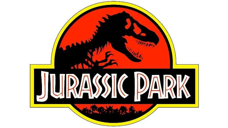
This was the beginning of the Logo. The very first logo still made us nostalgic. The composition of the drawing, color of this logo was perfect. There was a bloody red circle in a black-yellow frame.
On the left side of the badge was the main attraction point. Yes, it’s all about the dinosaur skeleton drab in black. The rectangular banner also draws people's attention.
It was on the bottom part of the badge. The banner was just crossing the badge and the name is written in the white but bold letter. The best thing is this banner is in the same frame.
From 1997 to 2001
The first change we found was in the Jurassic Park logo in 1997. The only thing that was changed in this logo was the inscription on the badge. It was "The Lost World" but the tagline was the same as always.
On the other hand, it's embalmed. This time the red shade has black accents. Even the texture had a "cracked" feature.
Besides, the outline got some changes. There are three new circles. One is thick yellow and another two has two blacks.
From 2001 to 2015
In 2001, we found a big change in the logo of Jurassic Park. This was more dramatic for us than before. There is no black, red, and yellow color palette.
Now we have in this logo gray and red. The red color defines the mysterious environment and the gray has a metallic look with the shade.
With the silver-gray scheme, the banner also gets a more rectangular shape. The background of this banner is also dark gray with a red inscription.
The biggest attraction in our eyes is the claw scratches they made with diagonal lines. It was perfectly placed on the right from the wordmark.
From 2015 to 2017
Finally, in 2015, we'll have this logo with a three-dimensional look. This time the banner also got shadowed even by the letter.
With a gray theme, the skeleton had a darker shadow. Fans said this logo looks more dangerous, dramatic, and brilliant.
2018
In 2018, the palette got more depth as a three-dimensional logo based on monochrome, gradient, and black shades.
2022
The upcoming movie "Jurassic Park: Dominion" released a new logo and this time the original skeleton arrived again with the red and yellow circle. But this time, it became smaller.

How Does The Original Jurassic Park Logo appear?
The mastermind of this logo comes from Chip Kidd. He visited the Museum of Natural History. He took a picture of the dinosaur and looked at the bones.
On a tracing paper, he starts to draw the creature. It looks simple and makes the iconic logo that is now recognizable by every person in the world.
This logo becomes appreciated for another two factors, one is the font used in the banner and the color used in the whole logo.

Conclusion:
Jurassic Park Logo is the best thing that we've got from the Jurassic Park franchises. Chip Kidd knew how to make this logo more iconic, colorful, and simple.
Universal Pictures Marketing Executive Tom Martin also helps Chip Kidd to make the skeleton memorable. We know this logo is now appearing on every cover of the book and the movie poster. Even this logo was the key point to sell all the merchandise from the franchise.
In every sequel, we are expecting a different logo for Jurassic Park. This most famous logo will remain intact all the time in our hearts.
Fyxes
Thoughts, stories and ideas.


